
CENTSAI REDESIGN
OVERVIEW
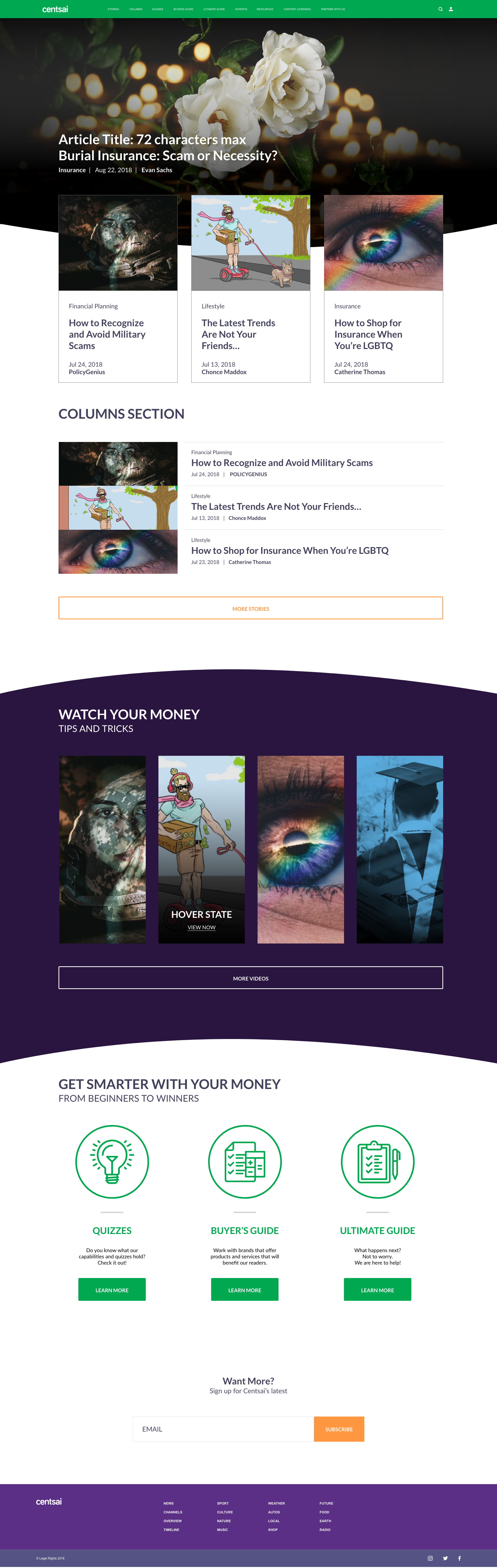
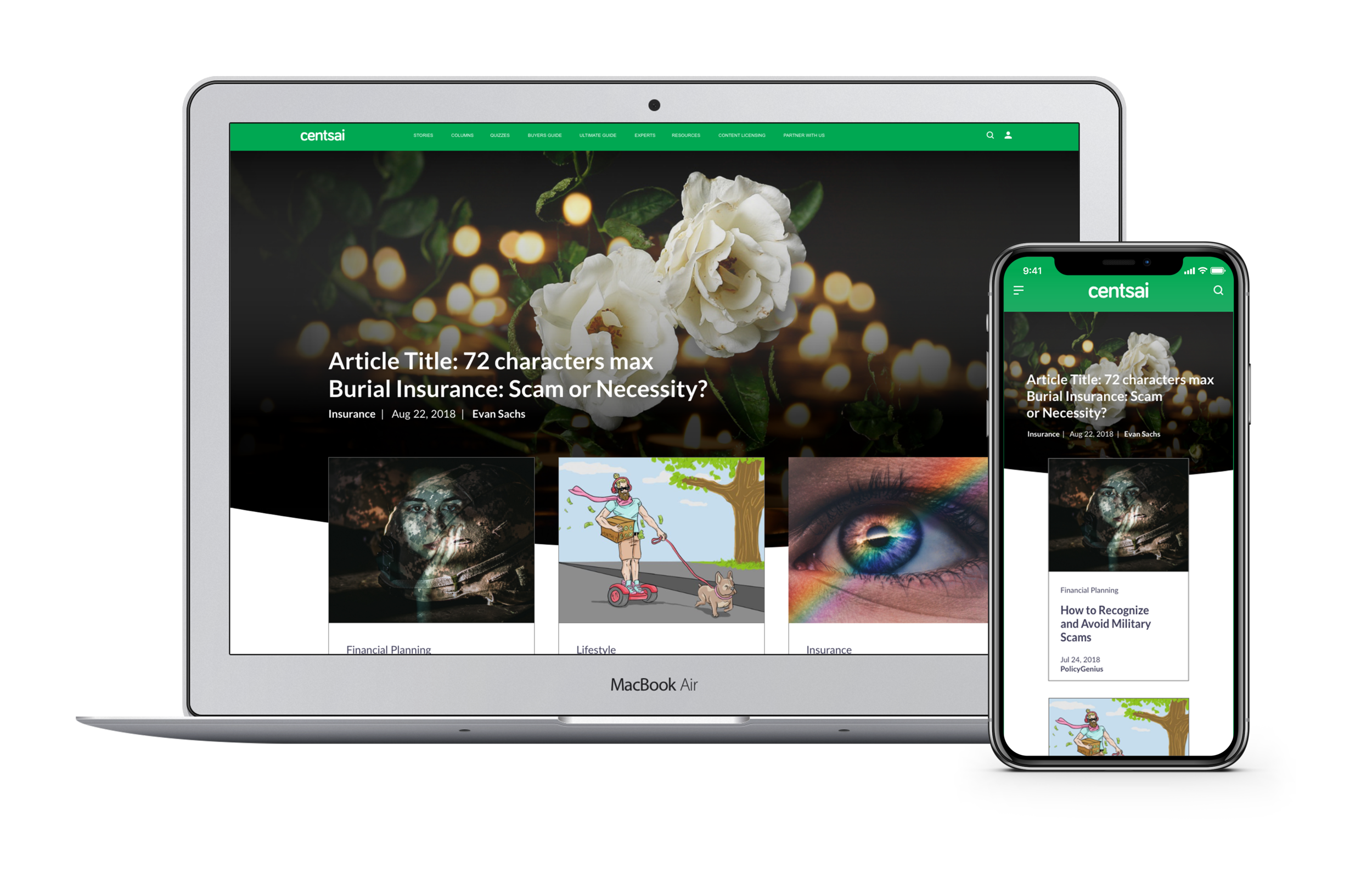
Centsai homepage design
ROLE: Lead UI UX Designer / UI UX Consultant
SOFTWARE: XD, Photoshop, Illustrator, After Effects
TAGS: UI UX Design, Responsive Design, Brand and Identity, Web Design
BACKGROUND
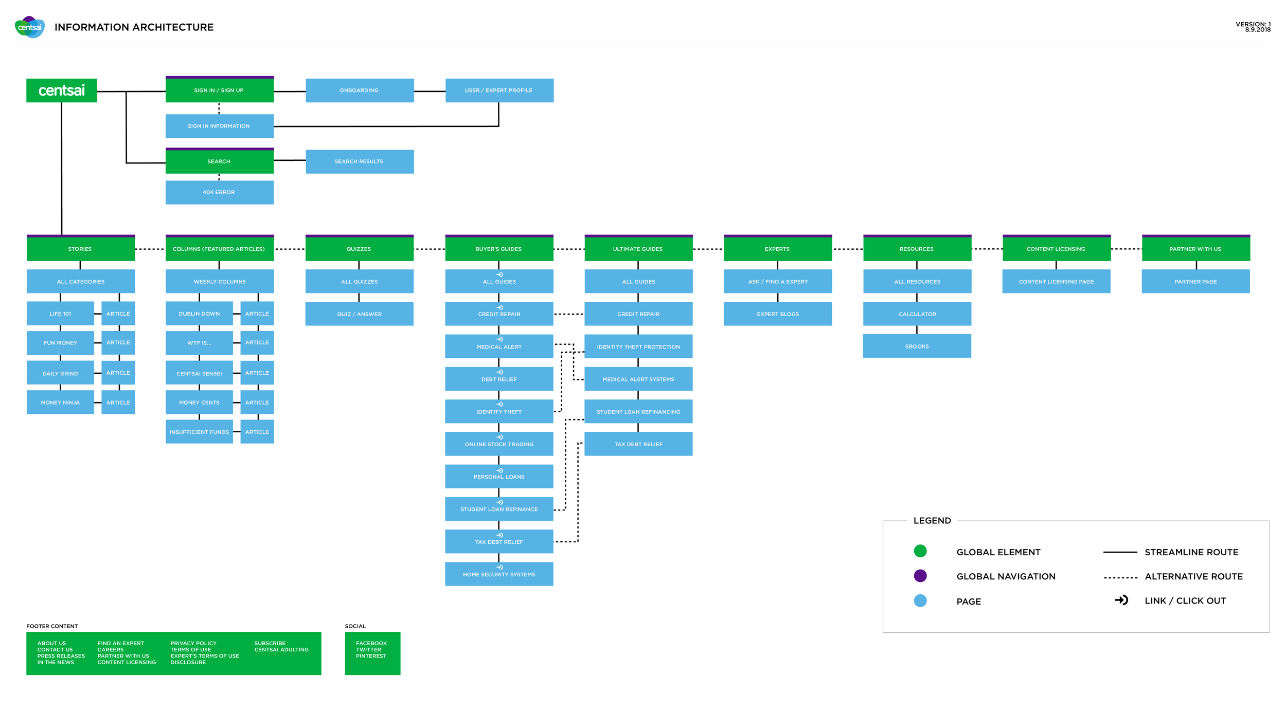
The brief for this project was to design an experience that helps users discover and connect with financial literacy, without relying on financial companies and advisors. Screens on the site looked and behaved differently, as several independent teams developed them with varying timelines. This was creating no traffic and page abandonment within the ‘Buyer’s Guide’ screen. There was no consistent user flow that connected from the homepage, to article, to buyer’s guide page. Centsai's Content was clutter and counter intuitive which creates a distortion in the user journey, with results of user drop outs within 2 clicks.
Centsai ‘Buyer’s Guide’ screen design
INSIGHTS & RESEARCH
Structured research revolved around 3 main insights to carry into the final platform.
How does users approach financial literacy?
How does users 'connect' with the content?
What creates the sense of urgency?
These 3 question are benefactors towards the UI / UX and content, which will play a huge role in how the redesign is approached. Logistics from the research will create a universal ecosystem with a consistent navigation and UI patterns. Below are sketches regarding the redesign, the ecosystem of Centsai, and other note taking details.


INTUITIVE NAVIGATION
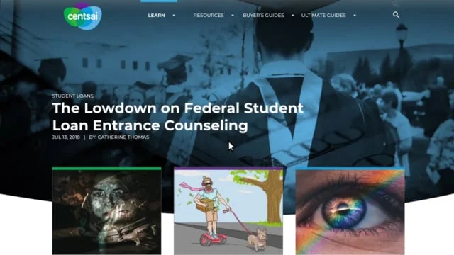
I believed that creating a smooth and intuitive way to navigate content was a key element for the redesign. I went for a image to content -based approach that encouraged browsing and also differentiated pages from the clean interface in other parts of the site. Prototyping played an important part in the iteration process. I share flows to demonstrate complex interactions. On the right, is a example of how a user is browsing an articles with a popup CTA (low fidelity design). This interaction was based on how users can access the buyer’s guide page within an article.
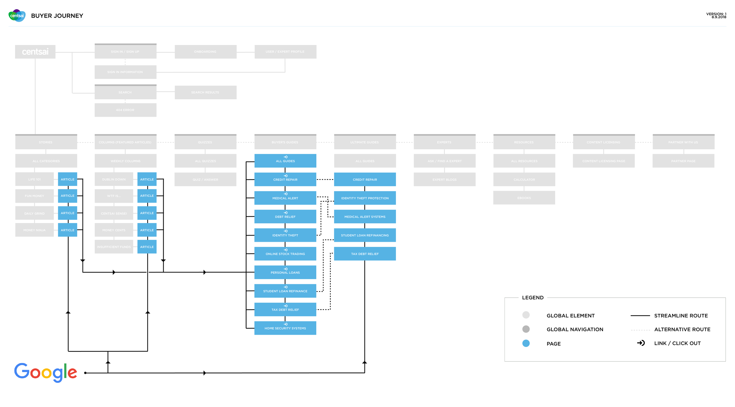
SOLUTION
Created a user flow that connects the user from homepage, to article, to buyer’s guide. Content is seamless and intuitive to transition the user efficiency and effectively. A linear user flow will be must impactful with out disrupting the experience. Flow will consist of 4 clicks to get user to homepage to buyer’s guide.
GOALS
Redesign the entire eco system to only surface the most important ones and redefined the information architecture by giving more focus to each section. Design and structure content in a way that encourages interaction, easy skimming, and accessible entry and exit points. Enable users to effortlessly lead towards the ‘Buyer’s Guide’ page, which will empower the user to take control over the content thats provided. How the user interacts within the content, and basic styling will supports our goals.